Mobile Site Comparison
Example of a Good Site

Mobile Site Comparison
Example of a Good Site
Pinterest
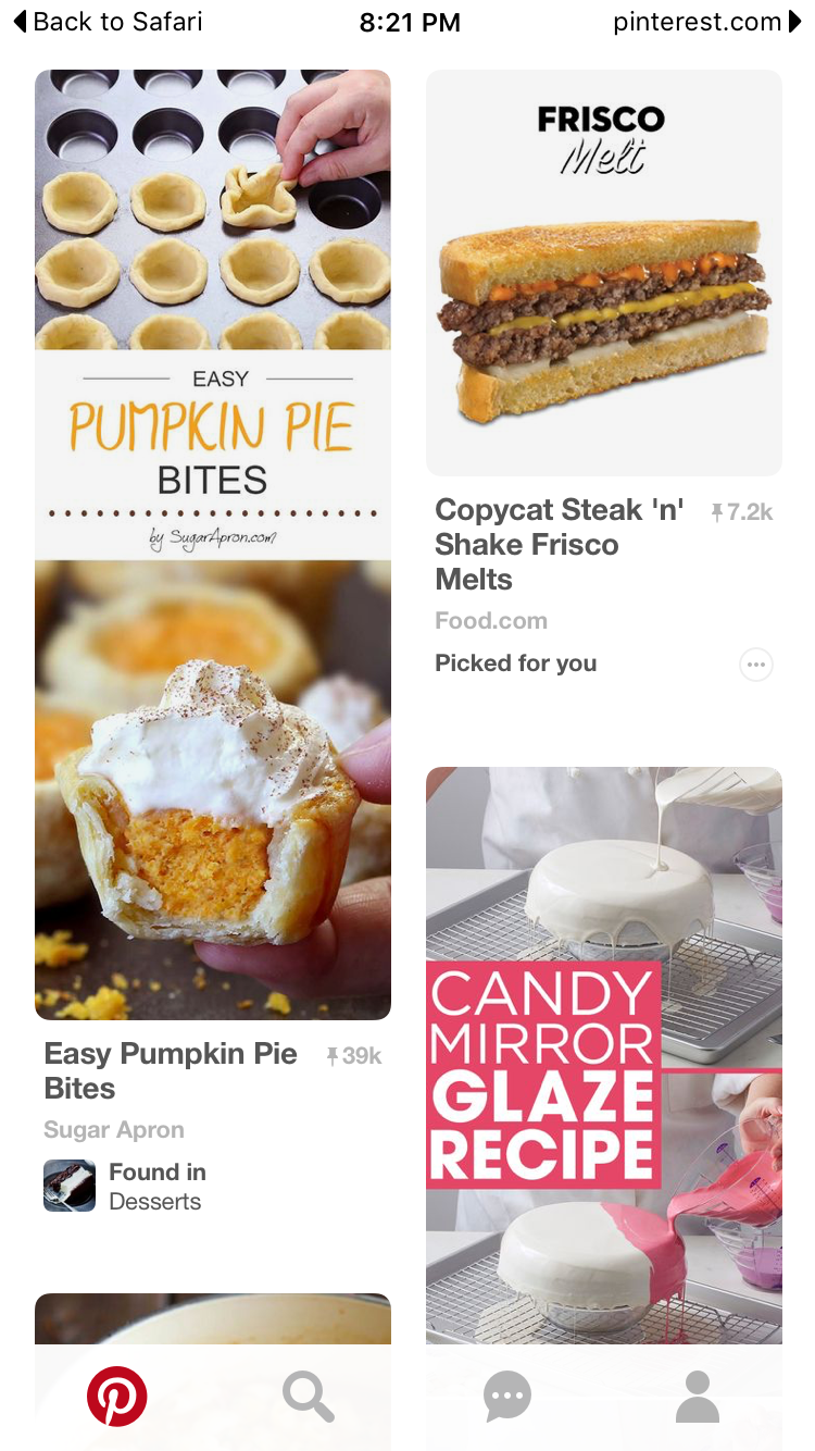
URL:http://www.pinterest.com Pinterest site
Once signed in, the site recommends using their app but it worked fine in Safari.
Everything was clear. I was able to select a recipe and see it.
It was easy to figure out how to get around.
The photos of the food speak for themselves. The white background is perfect!
I don't like that this site allows others to see what I pin. People search in my stuff and use my ideas. Pinterest might have a private area, that I dont know about.
These sites are bad for different reasons.
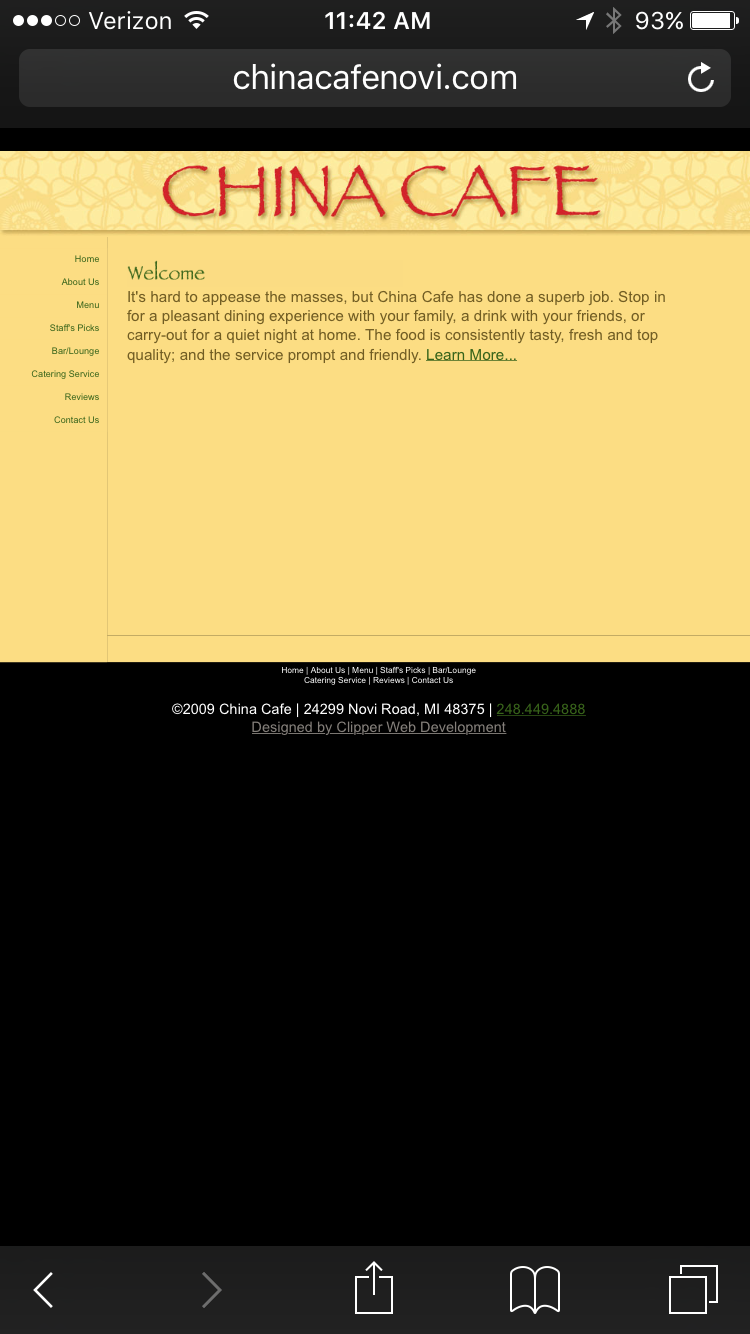
URL:http://www.chinacafenovi.com China Cafe site
URL:http://www.panera.com Panera site
This is my complaint about the Panera site. There is nothing there to tell you what to do. Or even that you are in the right place.
The ChinacafeNovi site is so small when it comes up, you can't see it
For the Panera site, you have to guess what to do. If you guess right, you can get around. This is so unprofessional to me, especially for such a large company.
Chinacafe is boring. Panera has a white background a only 3 things on it. So bad!
Both of these sites are annoying. Panera is so hard to manipulate and figure out. Chinacafe is impossible to see.
Screenshots of these Mobile sites
